Pastry Shop Website Case Study

Project background Image

Project Background

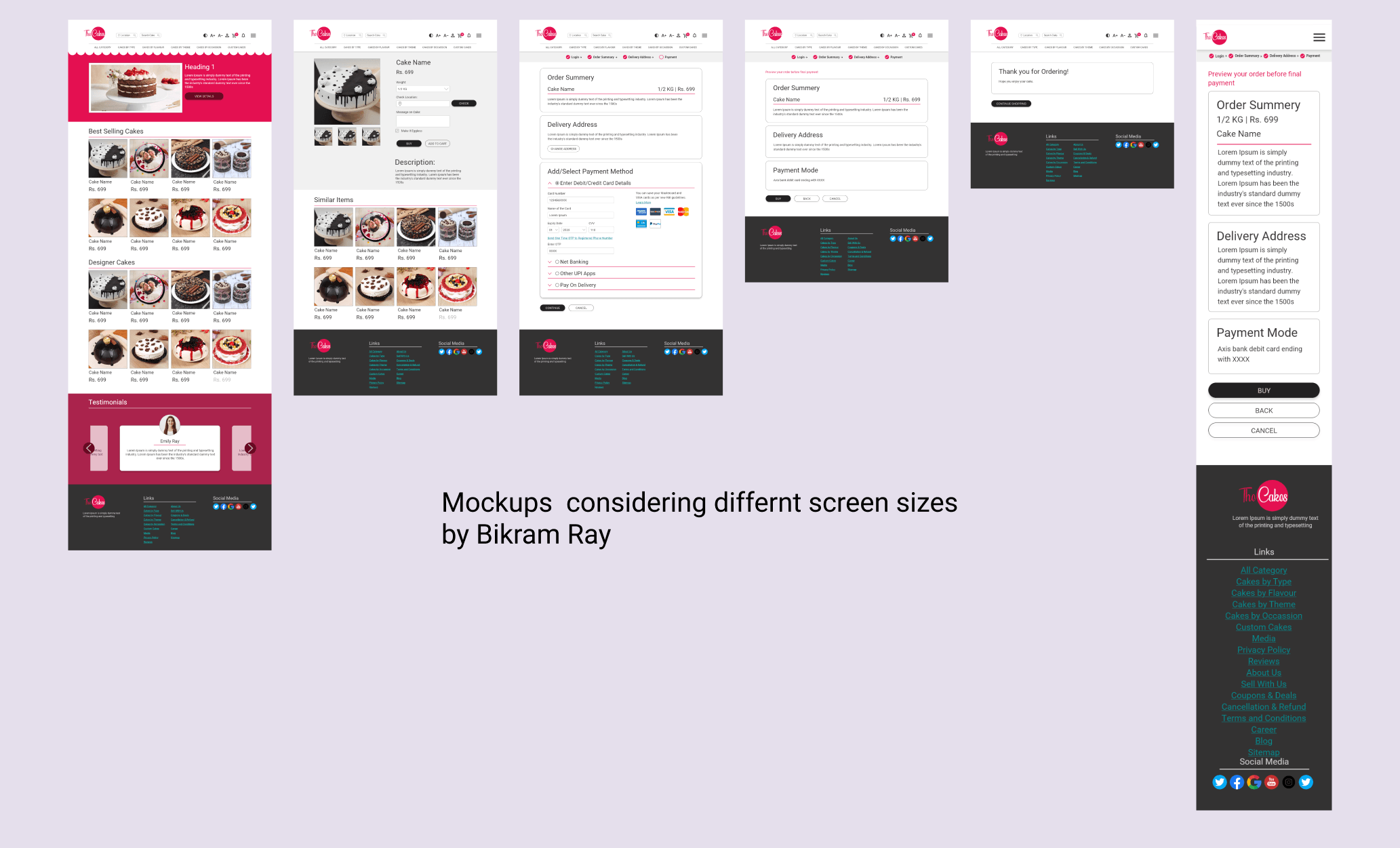
This online pastry order desktop app is meant for office admins, HRs, office event co-ordinators who need to order pastries for various occassions as per their tastes and can save a lot of time by avoiding a physical vist to a cake shop.

Project Duration: Nov 2021 to Dec 2021

The Problem

Generally, a lot of online bakery shops are available where the sellers try to sell so many products like breads, cookies cakes and so on. Most of apps/websites are very destracting and cluttered. Besides, at times, there are not even responsive.

The Problem
Project Goal

Project Goal

The goal is to design a simple and eye-catching online shop that only deals with pastries for various occassions. Also, the online pastry shop can easily be accessed from various devices like smart phones and tablets.

bikram

My Role In This Project

Responsibilities were to do the research, conduct competive audit, create persona, wireframes, conduct usability study, create lo-fi and hi-fi mockups and prototypes.

My role in this project was to handle the research part and create the final designs as well.

Users

Our Users

Office Admins, HRs, Office event co-ordinators, Pastry lovers!

Target users can't often manage time to organise food or pastries for office parties by personally visiting a shop.

I conducted secondary interviews, open surveys and competitive research to understand the user needs. Created empathy maps, personas etc. What I found is that, most of the sites are dealing with so many other things beside pastries that somehow destruct the users from their actual goal of buying pastries for occassions. The sites are cluttered and filled with so many unwanted content. Accordinly, the users get lost and become frustrated. They find it very confusing when they see too many options to choose from.

User Research

UX Research

The main steps that I took to empathize users for a better understanding of the user requirement is to conduct online interviews (due to work from home and pandemic situation) of my office colleagues who belong to the admin team to understand their pain-points as they opt to buy pastries, desserts etc. for office parties such as birthdays, anniversaries, project success parties etc.

I created personas, user stories, and user journey map to understand and define the problem statement. I also created a sitemap to organize the flow and data.

User Pain Points

1

Navigation

Complicated navigation, steps are not well-defined or clearly visible that shows the complete shopping path.

2

Interaction

A lot of sites can’t be accessed properly through devices like smart phones, tablets. Too many content makes the desktop space cluttered.

3

Experience

The users often find the flow of payment methods confusing. At times, no proper confirmation messages or screens are available.

Paper & Digital Wireframes

Paper & Digital Wireframes

After creating a sitemap, I started working on simple paper wireframe to get a quick idea. Then, I converted the paper wireframes to digital wireframes.

Prototypes

Lo-fi & Hi-fi Prototypes

For Lo-fi prototype in Adobe XD, I connected all the screens in a manner that the user can easily move forward and go back to the previous screen if needed.

My hi-fi prototype followed the same user flow as the lo-fi prototype, and included the design changes made after the usability study, as well as several changes suggested by members of my team.

Final Mockups

Final MocKups

Based on the insights gathered, I prepared the final mockups. To create this, I used Adobe XD tool.

THANK YOU FOR SPENDING YOUR VALUABLE TIME AND WATCHING THE CASE STUDY!